v v v


v v v
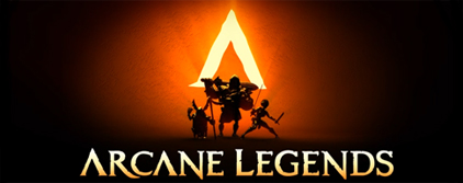
Bremen - Origin of Anarchy - Arcane Legends

Pros: Smudge/Blend is nice. Nice filters and coloring. Shadowing seems done pretty well. (Not sure if you did manually, or if that's how the render was originally.. but honestly who cares. It ended up working.)
Cons: A bit too chaotic. Text overflow (Perhaps just "Origin of Anarchy" or just "Bremen"). Lacking depth. Sometimes that works out fine, depending on the style, but with a 3D render, and 3D filters, the piece seems pretty flat.
I think it's pretty nice, but I figured I'd offer my critique, just in case you were interested in some.
If not, my mistake. Pretend I never said anything, aside from "I think it's pretty nice"
Incidentally, I’m wearing my lap-dance pants.

A little too messy? Can't really catch the wordings.
Thanks, appreciate the critique, looked much better before I had to dumb it down to 15kb which sucksOriginally Posted by Ambient

Bremen - Origin of Anarchy - Arcane Legends


Looks nice, I like it. Especially the effects around the dude. Like a water color, gas/smoke feel to it. If anything I had to pick on... The words could of had some darkness or black around them to make them have a stronger presence.
"Still Retired but casually dueling in PvP from Time to Time"EXTREME BOSS SLAYERS Are Back!Wanting a signature? Send me a Pm (SL credits only)

Design actually isn't too bad, but there's a teal overflow. You need to add some variety.
Need to space out the words, if I may suggest, try something like-
-BREMEN-_____
-ORIGIN OF MAGES-
-MAGE-
You can either make that font "strong", or "Smooth". That shows up when you're using Trajan font. You can try using stroke, something flowman drummed into my brain, size 1, to put a contrast between text and renders.
Again, the color choice and blend is superb, but ratio is off. Too much of one color dominating your sig.

At a glance it looks pretty cool. Ambient has a good eye and his analysis is pretty thorough. Nice work.
Not sure how/if you're layered but a contrast adjustment could go a long way with minimal effort.
Last edited by DontNerfMeBro; 12-09-2012 at 05:30 AM.
Thanks, I really do appreciate the critique
Bremen - Origin of Anarchy - Arcane Legends
I like it. It's cool.
 Posting Permissions


Bookmarks