Page 1 of 3 123 LastLast
Results 1 to 20 of 45

Thread: attempted new sig design

  1. #1
    Senior Member Burningdex's Avatar
    Join Date
    Dec 2011
    Posts
    2,996
    Thanks Thanks Given 
    2,087
    Thanks Thanks Received 
    519
    Thanked in
    365 Posts

    Default attempted new sig design

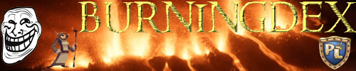
    hi guys i just recently purchased photo shop and decided id try and make a new sig so heree it is


    edit: heres this one 2
    Name:  SIGNATURES.jpg
Views: 114
Size:  85.4 KB
    Name:  Untitled-1.jpg
Views: 281
Size:  52.1 KB
    Name:  sig1.jpg
Views: 285
Size:  67.5 KB
    Name:  sig.jpg
Views: 130
Size:  79.1 KB
    Last edited by Burningdex; 11-09-2013 at 04:06 PM.
    nothing lasts forever

  2. The Following User Says Thank You to Burningdex For This Useful Post:


  3. #2
    Banned SayCreed's Avatar
    Join Date
    Oct 2013
    Location
    lala
    Posts
    2,329
    Thanks Thanks Given 
    223
    Thanks Thanks Received 
    190
    Thanked in
    156 Posts

    Default attempted new sig design

    Nice sig

  4. The Following 2 Users Say Thank You to SayCreed For This Useful Post:


  5. #3
    Senior Member Burningdex's Avatar
    Join Date
    Dec 2011
    Posts
    2,996
    Thanks Thanks Given 
    2,087
    Thanks Thanks Received 
    519
    Thanked in
    365 Posts

    Default

    Quote Originally Posted by Rushed View Post
    Nice sig
    the one in the post or one in the signature part
    nothing lasts forever

  6. The Following User Says Thank You to Burningdex For This Useful Post:


  7. #4
    Senior Member Sheugokin's Avatar
    Join Date
    Aug 2012
    Location
    Sixth Dimension
    Posts
    4,071
    Thanks Thanks Given 
    391
    Thanks Thanks Received 
    599
    Thanked in
    388 Posts

    Default

    Both

  8. The Following 2 Users Say Thank You to Sheugokin For This Useful Post:


  9. #5
    Senior Member Burningdex's Avatar
    Join Date
    Dec 2011
    Posts
    2,996
    Thanks Thanks Given 
    2,087
    Thanks Thanks Received 
    519
    Thanked in
    365 Posts

    Default

    Quote Originally Posted by Sheugokin View Post
    Both
    Yus! Thts like my 2nd ever attempt at a sig @.@ the one in the sig part was made by occult tho but the pic in the post was by me
    nothing lasts forever

  10. The Following User Says Thank You to Burningdex For This Useful Post:


  11. #6
    Senior Member Sheugokin's Avatar
    Join Date
    Aug 2012
    Location
    Sixth Dimension
    Posts
    4,071
    Thanks Thanks Given 
    391
    Thanks Thanks Received 
    599
    Thanked in
    388 Posts

    Default

    For as starter sig, that is pretty darn good, better than I can do lol.

  12. #7
    Senior Member Burningdex's Avatar
    Join Date
    Dec 2011
    Posts
    2,996
    Thanks Thanks Given 
    2,087
    Thanks Thanks Received 
    519
    Thanked in
    365 Posts

    Default

    Quote Originally Posted by Sheugokin View Post
    For as starter sig, that is pretty darn good, better than I can do lol.
    Starter to photoshop or forums? Lol and ty
    nothing lasts forever

  13. #8
    Senior Member
    Join Date
    Mar 2013
    Location
    Arendelle
    Posts
    1,102
    Thanks Thanks Given 
    282
    Thanks Thanks Received 
    521
    Thanked in
    262 Posts

    Default

    You can see the black rectangle on which the name is. Also, the PL shield is cut-out pretty badly... The blue-red fire thingy is way too low qualitity compared to the rest of the signature and it is way too horizontally stretched and on the bottom edge of the signature you have some nasty buggy lines going on.

    You should not be happy with this, but keep trying though, its a start.

    Criticism ftw!
    Beware of the Tinfoil - it's coming...
     
    Arendelle's in
     
    deep
     
    deep
     
    deep
     
    deep
     
    snow.

  14. #9
    Senior Member Burningdex's Avatar
    Join Date
    Dec 2011
    Posts
    2,996
    Thanks Thanks Given 
    2,087
    Thanks Thanks Received 
    519
    Thanked in
    365 Posts

    Default

    Quote Originally Posted by LEVEL ONE View Post
    You can see the black rectangle on which the name is. Also, the PL shield is cut-out pretty badly... The blue-red fire thingy is way too low qualitity compared to the rest of the signature and it is way too horizontally stretched and on the bottom edge of the signature you have some nasty buggy lines going on.

    You should not be happy with this, but keep trying though, its a start.

    Criticism ftw!

    I see what u mean , it was like 6am tho lol
    nothing lasts forever

  15. #10
    Senior Member
    Join Date
    Mar 2013
    Location
    Arendelle
    Posts
    1,102
    Thanks Thanks Given 
    282
    Thanks Thanks Received 
    521
    Thanked in
    262 Posts

    Default

    Also, its posted in the wrong section of the forum.
    Beware of the Tinfoil - it's coming...
     
    Arendelle's in
     
    deep
     
    deep
     
    deep
     
    deep
     
    snow.

  16. #11
    Senior Member Burningdex's Avatar
    Join Date
    Dec 2011
    Posts
    2,996
    Thanks Thanks Given 
    2,087
    Thanks Thanks Received 
    519
    Thanked in
    365 Posts

    Default

    Quote Originally Posted by LEVEL ONE View Post
    Also, its posted in the wrong section of the forum.

    Hardly anyone looks in the fan art section tho is is better place to get feedback from :3
    nothing lasts forever

  17. The Following User Says Thank You to Burningdex For This Useful Post:


  18. #12
    Senior Member Burningdex's Avatar
    Join Date
    Dec 2011
    Posts
    2,996
    Thanks Thanks Given 
    2,087
    Thanks Thanks Received 
    519
    Thanked in
    365 Posts

    Default

    Quote Originally Posted by LEVEL ONE View Post
    You can see the black rectangle on which the name is. Also, the PL shield is cut-out pretty badly... The blue-red fire thingy is way too low qualitity compared to the rest of the signature and it is way too horizontally stretched and on the bottom edge of the signature you have some nasty buggy lines going on.

    You should not be happy with this, but keep trying though, its a start.


    Criticism ftw!
    thx
    nothing lasts forever

  19. #13
    Banned
    Join Date
    Nov 2010
    Location
    That bush behind you
    Posts
    4,927
    Thanks Thanks Given 
    704
    Thanks Thanks Received 
    2,056
    Thanked in
    1,058 Posts

    Default

    I've seen better.

  20. #14
    Senior Member
    Join Date
    Sep 2012
    Posts
    4,757
    Thanks Thanks Given 
    1,377
    Thanks Thanks Received 
    711
    Thanked in
    481 Posts

    Default

    Better than most beginners GJ!
    Judgementals, Retired Officer of Rated M.

  21. The Following 2 Users Say Thank You to Extreme For This Useful Post:


  22. #15
    Forum Legend
    Join Date
    Jul 2012
    Location
    Retirement home
    Posts
    10,044
    Thanks Thanks Given 
    456
    Thanks Thanks Received 
    491
    Thanked in
    401 Posts

    Default

    Wait, so are you quiting or no?

  23. The Following User Says Thank You to Spyce For This Useful Post:


  24. #16
    Senior Member Burningdex's Avatar
    Join Date
    Dec 2011
    Posts
    2,996
    Thanks Thanks Given 
    2,087
    Thanks Thanks Received 
    519
    Thanked in
    365 Posts

    Default

    Quote Originally Posted by Sheriff View Post
    Wait, so are you quiting or no?
    Idk just not as active as usual
    nothing lasts forever

  25. #17
    Senior Member Burningdex's Avatar
    Join Date
    Dec 2011
    Posts
    2,996
    Thanks Thanks Given 
    2,087
    Thanks Thanks Received 
    519
    Thanked in
    365 Posts

    Default

    Quote Originally Posted by dudetus View Post
    I've seen better.

    Ur so wise
    nothing lasts forever

  26. #18
    Senior Member programmed's Avatar
    Join Date
    Jun 2012
    Location
    USA
    Posts
    4,516
    Thanks Thanks Given 
    593
    Thanks Thanks Received 
    483
    Thanked in
    384 Posts

    Default attempted new sig design

    Quote Originally Posted by Burningdex View Post
    Ur so wise
    Ofc he is. No ones smarter than dude. Nice job btw, its a great start. Also I never used photoshop before but I'd put the flames on a separate layer (if photoshop has layers) than the words in the second sig. That way the flames will show in front of the words and you won't the the outline if the square from the words. And maybe brighten up the fire on both of them, it looks a little dull but maybe its just my screen brightness. Same thing in the first sig about the layers. It'd look nicer if you had the character pic and the words each on a separate layer. And on the first one maybe use a different font for the words "burningdex", its not easy to read. Good job though, these are just my advice. I'm no professional but working with computer programs and arts are kind if a hobby.
    Last edited by programmed; 11-02-2013 at 08:46 PM.

    Programmed-Level 85 mage, Praktica-Level 85 rhino

  27. The Following User Says Thank You to programmed For This Useful Post:


  28. #19
    Junior Member AwesomeTV's Avatar
    Join Date
    Oct 2013
    Location
    Holland MI
    Posts
    19
    Thanks Thanks Given 
    2
    Thanks Thanks Received 
    1
    Thanked in
    1 Post

    Default

    Way better then when I was starting off all it takes is pro youtube videos and you're on your way to becoming a good signature designer! great job
    Pvp Twinks - AmazinglyGay - lvl 15,VietPvper - lvl 18

  29. #20
    Senior Member Burningdex's Avatar
    Join Date
    Dec 2011
    Posts
    2,996
    Thanks Thanks Given 
    2,087
    Thanks Thanks Received 
    519
    Thanked in
    365 Posts

    Default

    Quote Originally Posted by TheScaryBeary View Post
    Ofc he is. No ones smarter than dude. Nice job btw, its a great start. Also I never used photoshop before but I'd put the flames on a separate layer (if photoshop has layers) than the words in the second sig. That way the flames will show in front of the words and you won't the the outline if the square from the words. And maybe brighten up the fire on both of them, it looks a little dull but maybe its just my screen brightness. Same thing in the first sig about the layers. It'd look nicer if you had the character pic and the words each on a separate layer. And on the first one maybe use a different font for the words "burningdex", its not easy to read. Good job though, these are just my advice. I'm no professional but working with computer programs and arts are kind if a hobby.
    layers i can never get to merge into 1 pic so yea
    nothing lasts forever

  30. The Following User Says Thank You to Burningdex For This Useful Post:


Similar Threads

  1. Replies: 3
    Last Post: 02-23-2013, 09:47 AM
  2. Game stuck on loading screen when attempted join with full inventory
    By RedRyder in forum DL Technical Issues and Bugs
    Replies: 0
    Last Post: 08-28-2012, 07:15 PM
  3. Different design?
    By giayuan in forum PL Suggestions and Feedback
    Replies: 2
    Last Post: 02-09-2011, 09:17 PM
  4. Change thoth helm design to fabz design
    By Violentsaint in forum PL General Discussion
    Replies: 32
    Last Post: 09-03-2010, 11:15 PM

Bookmarks

Posting Permissions

  • You may not post new threads
  • You may not post replies
  • You may not post attachments
  • You may not edit your posts
  •