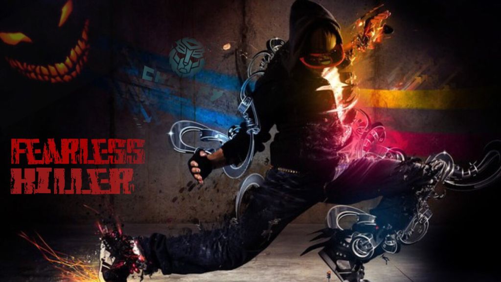
added the chrispy dude...haha
let me know how ya like it...


added the chrispy dude...haha
let me know how ya like it...


Are the below deacriptions what you like?
-A lot of Black
-Neon colors as contrast
-No flat colors, silhouettes, splicing, or color fuzes.
-Logos (specifically Chrispy's) included.
-You name as big as possible.
-Your ame is part of the focal point instead of a tag or title.
-Light to cover black space.
-Stark contrasts between features without overlaps.
---
If so, I'll start over.

Reserved
-Rated
added one thing...

hithis is my entry
Last edited by qoutascava; 07-04-2014 at 12:02 PM.

Edit : Made a small change
Changes welcome.
-Rated
Last edited by The Goat; 07-04-2014 at 12:39 PM.
Added light to dub-dj butterfly part.

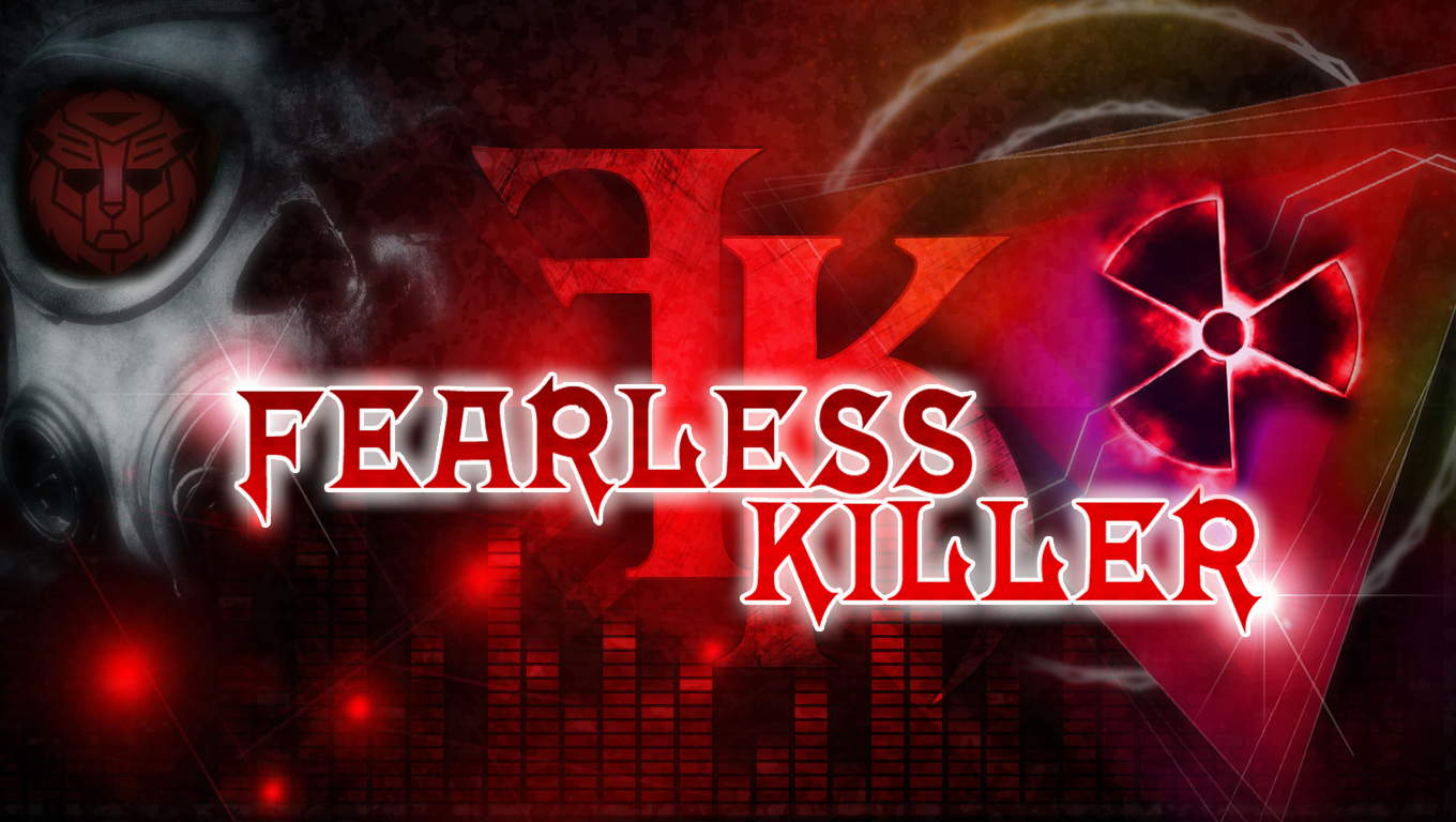
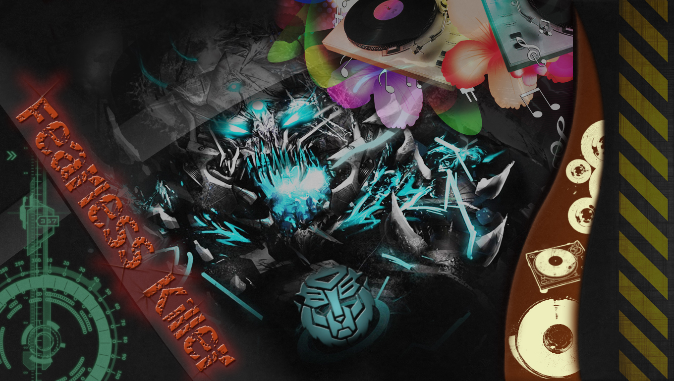
Hey here is my entry. There is a difference with each one just tell me what you think and any changes u would like
First
Second (original)
Third (added more logos)
Fourth (made it all brighter)

You guys are epic! ALOT of these wallpapers are just awesome, high quality, nice contrast and everything is so clean!!! (I just wanted to add that :P) it will be SO HARD to choose the winner!!!
Sure, anyone can join :POriginally Posted by Deadroth

If you could make it the right size and HD, it would be good. Thought there are alot of awesome entries so far, so try to catch my attention!
THIS IS GOLD! damnit so awesome.
I ment the wallpaper feels empty if you remove the hand (Cause i dont like it)
Well i dont have an ipad but ipod 5 :P. By the way i totally love it, but if you could play with the contrast to make it look even more awesome!!!
Yes but 1 thing. I prefer if the name DOESNT take the whole place, kinda like these other great entries that i had
Dude both yours are just awesome. Id use both if you won ^^.
No offence but these are low quality (I can see the pixels)
The edit is really nice, but the resolution and the pictures look low quality. Idk if im the only on to see this thought.
As i said to many others. This looks low quality...
This one is even more perfect, but as i said, add more constrast or light (Idk how to call it) to the blue parts of the wallpaper. Kinda flashy and more attractive.
If you could make it more hd and more attractive! Or try something else.
You're awesome too ! One edit tht would be great for both. Make the disturbed logo face more clear (Less blurry) and make it flashy and attractive so your eyes catch on it.
Added a poll (http://strawpoll.me/2046778) to choose how the reward will be given
Okay buddy

I tried something new

Ign:Fvw
There we go
Ipod? No problem
EVEN MORE FLASHY ONE:
Last edited by Deadroth; 07-04-2014 at 03:01 PM.
Reserved

I don't want to have to redo it tens of times, so below are some backgrounds - tell me how you want the text/icons designed and I'll get to work!
Last edited by Azemen; 07-04-2014 at 04:02 PM.
"Vision without action is a daydream. Action without vision is a nightmare." - Japanese Proverb
IGN: Pureloot
Really struggling with what you like. Not my forte I guess. Going to go all out with what I had started and submit that.
I've experimented by adding more of the blue abstract around the edges so that it doesn't look too plain, but I like it when there isn't too much, because too much of it doesnt look too good IMO.
Any changes are always welcome.
-Rated
Please tell me how these arethanks and good luck on ur adventure!
Freehand writing
Original
More logos!
Brighter more wow lol
 Posting Permissions


Bookmarks