


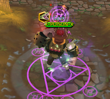
I do think the new POISON title is nice, but I find it weird that the letters are off centered and sticking out of the box. I asked a few friends and they agree that it looks weird. Who else feels this way?
And if not a change, then an improvement for future events


Bookmarks