
Im using a DROID X, and I cannot scroll through the join game menu. When I hit the scroll buttons it thinks I am moving as I can scroll all the way to bottom, but the game names never change, stuck at the top of list.


Im using a DROID X, and I cannot scroll through the join game menu. When I hit the scroll buttons it thinks I am moving as I can scroll all the way to bottom, but the game names never change, stuck at the top of list.
's Avatar")
Umm whenever you fire/shoot/throw an shivering ice talon/crossbow, the spike starts spinning around in the air and then eventually dissapears. Im telling you now, not to fix it cuz it looks really coolnah you devs can do whatever you feel like doing with that bug
PL- Ninjaguide (helper, hoping to soon become an AoA)
SL- Fatninja ( commando ), Skinnyninja ( Engineer ) Thinninja ( operative )
Lol u never edited anything, if you did, it would say at the bottom of your post, "last edited by_____"Originally Posted by Beakofjustice

PL- Ninjaguide (helper, hoping to soon become an AoA)
SL- Fatninja ( commando ), Skinnyninja ( Engineer ) Thinninja ( operative )
Some more glitches..
Bird heal doesnt heal while moving.
Buffing while moving will get u lose your target
Delay on avian. More than before
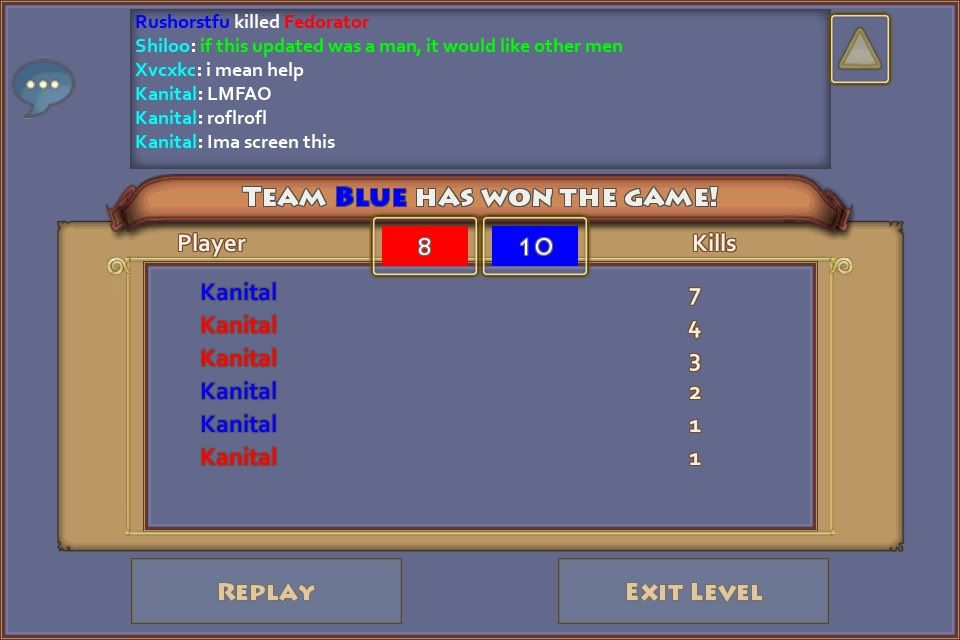
Nice billion kills no?
Why white?
Also wanted to add that my fingers are way too big for the spell size...
And the joystick is way too close to the left border.. Makes turning left slower.
And the higher vision makes it impossible to guess 10 and 12m range i don't know why we should keep playing it... I'll be back when all this is fixed ( the little party hat is optional)
Last edited by Kanitall; 06-20-2012 at 11:06 AM.

I play on an android, not an android tablet.
Every button is too small.
I think we should be able to see our own name.
Names and titles are too big.
Move back joystick to bottom left.
Um that's not really Humania feedback so...
Bosses need a little more hp and special abilities would be nice.
Drop rates higher.
Some purples? Maybe put them in quests? Haven't seen one yet.
Enemies need lower hp or attack. (Not bosses)
Bug:
When searching for games I can only see the first page. I can tap the arrow to go to other pages but it still shows the first page.
Wow...you need to stop flaming, i would if i were you.
PL- Ninjaguide (helper, hoping to soon become an AoA)
SL- Fatninja ( commando ), Skinnyninja ( Engineer ) Thinninja ( operative )

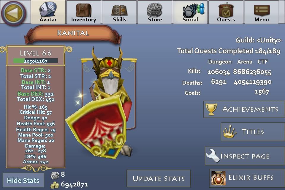
One of the things that is happening to me idk if it's happens to anybody else is that after a pvp match it shows that I have all the kills which I don't.
As everyone is saying the buttons on iPad are way to big and the character names which in balefort is a pain.
Also that there is a bug that shiv talon and shiv xbow leave the the projectiles stuck on walls in towns.
Plz fix.
Also that the scenery in forests looks empty and obsolete
Last edited by Chickenwinu2; 06-20-2012 at 11:42 AM.

Guys,
Being a software engineer, I can tell you that this update was neither lazy, nor amateurish. There is a lot of work that goes on behind the scenes that you will never see, nor really ever appreciate. Simple effects like the water, while cute, surely took weeks to code - something which many posters do not appreciate. There is a lot of work involved in pushing out any kind of update, so give the devs a break and offer CONSTRUCTIVE criticisms. Simply saying this update sucks or goodbye PL doesn't help devs at all. Providing details like other have about which features, specifically, require attention will help the devs address your concerns. Better yet, if you could provide the devs a detailed instruction script to trigger a "bug" then not only can they find the issue, they could probably fix it as well. What so many of you are doing is akin to calling Microsoft and saying "Hey, my computer isn't working." There are so many variables to any software project, that personally, I ignore the incessant bitching-and-whining, and focus on the users who give me concrete examples of bugs, or useful feature requests. Just saying that "I don't like the update" helps nobody and just adds to the post count on a thread that is already pretty long.
So, with the above said, here are my thoughts, which is shared by most of the users on this thread:
- The skills icons are simply too small on a phone (mine is a Droid 2 Global with 480x854 resolution). On the display, the icons render in at ~5/8" and they are all pretty tightly spaced. This makes hitting the correct skill difficult - especially when tackling high level mobs that deal a lot of damage (like in Humania), and you are relying on trained repetition/twitch reflexes.
- The joystick is too small as well... I thought that the placement in the previous UI was better. By moving the joystick up, it often interferes with rotating the camera perspective. The new location feels a bit more uncomfortable as well, considering how most people hold a phone. Making the joystick larger and situated lower and more to the left would "open up" the gameplay area and feel more natural.
- The attack button is too small as well and there is too much padding on the right edge of the screen. I keep hitting the inactive gutter/padding and keep walking in the wrong direction.
- The font size on player names overwhelm low resolution devices, like typical Android phones. This is especially an issue in crowded areas like Forest Haven, Balefort Consignment Shop and others. The addition of the guild names below the player names just adds to the chaos, and makes all names in crowded areas unreadable. Perhaps, if you could scale the font size based on POV distance, that would help, or drop the Guild names on players more than ~20m away.
- The Inventory screen needs some work...specifically, it seems that the toon takes up way too much real estate and consequently, everything else seems too compressed - especially the inventory section. Since there is room below the toon, move the xx/yyy inventory slots used label below the toon. This would allow you to increase the size of the icons for helm/weapon/armor/etc. I would also take away some of the padding/gutter space around the toon. The inventory screen should focus on the inventory and the stats - the toon is nice for eye candy, but should not sacrifice readability/usability elsewhere. By removing some of the additional padding, you could squeeze in another 10-20 pixels for inventory. Also, remove the right side padding of the inventory list as I don't see an purpose for it (there are no up/down scroll buttons anymore).
- On the My Friends tab, move the SpaceTime Nexus button to the left under Guild. In it's current location, all the SpaceTime Nexus button does is take up space when you could probably fit one more friend in the visible viewport. Do the same with the Reject All/Accept All buttons and Add Ignore Name button.
- The quests tab has way too much padding on the left side. Move the Current Quests list farther to the left (to line up with Abandon Quest button) and extend the width of the list.
- The inspect screen needs some work as well. Similar to the Inventory screen, the rendering of the toon takes up too much space and make the important information/actions less attainable. Specifically, the Add Friend, Mute and Report buttons are too small and too close together. It is difficult to hit the correct button. I can see people accidentally muting the characters that they are trying to friend.
- In regular gameplay, the chat screen width has to be increased. Move the chat list so that it starts from the right side of the quick chat bubble and extends all the way to the notifications counter. Also, it would be nice if the chat list were scrollable (swipable) so that I could go back and see maybe the last 20-30 lines instead of just 9 lines of text.
- The Expand/Collapse skills button location makes no sense. This positioning is part of the reason why the skills icons are so small. Frankly, it would make more sense to the left of the attack button, so you could pick up the 20-30 pixels and make the skills icons larger.
- There is too much padding/space below the toggle notifications button and the top of the skills section. Reduce the padding so you can get some more space so you can increase the size of the skill icons.
- The popup notifications are super annoying! There doesn't seem to be a way to quickly dismiss it, or disable it altogether. At lease provide an option to disable this as it just interferes with gameplay. Like many, my friends list is huge, so I am getting constantly bombarded with popups.
As a general observation, it seems that there was too much focus on adding spacing/padding and not enough focus on gaming mechanics. Shrinking the joystick, skills and attack for the sake of adding some visual spacing looks good on paper (and on screen shots for gaming review toos), but has been a major hit to gameplay.
In a vacuum, each feature that was added is nice, but the overall implementation in reference to playing the game leaves something to be desired. Going forward, focus on the gameplay...approach each feature as the end user who has to consume the new UI. Don't clutter the viewport with unnecessary chrome/adornments that add little (if anything) and be mindful that most of us really aren't designers, so we won't care too much about whitespace, typography or other designer hot buttons, we just want to play and enjoy the community aspects of the game.
AL: Kalizzaa
Retired Officer of <Elite Runners>
Elite Chronicles: Solo guides for elite maps - No longer maintained

Me and the mrs are playing on ipads, and she prefers having it bigger like it is atm...
Why doesnt that surprice me -.-
Ill gladly wait for a fix myself
@ Goodsyntax
WOOOOW O.O that must have takes you ages
Yeah, it did, but I figured that if Devs are reading this, it would be helpful to understand the WHY and provide some reasoning. Fight logic with logic.
I am just assuming that everyone will just type TL-DR and be done, but I hope that Sam at least forwards it onto the devs to mull over.
TY for reading it :-)
AL: Kalizzaa
Retired Officer of <Elite Runners>
Elite Chronicles: Solo guides for elite maps - No longer maintained

On google chrome the character names and gameplay are huge
Rauekat-lvl 71 bird, Rauekit-lvl 68 bear, Rauekot-lvl 43 mage, Rauekatjr lvl 15 bird! Proud recruiter of "The Elite"! Soon to be officer I hope!

I do agree with you, but lets talk about Usability. I've been involved with usability for my study and work and when you see a release like this after 9 months, it raises an eyebrow. Either usabilty and/or user acceptance tests were not included. For STS it's very important to have a uniform platform on which they can develop and expand, also the financial model behind that platform is important. In the case of this UI update most focus was on STS and not their customers. This was already the case with DL, but most people didn't notice because it was a new game anyway. "Strange location of the joystick? Oh, must be because it's a new game", would users say. Except now the team hits a bump in the road. STS had a superb UI, probably the best around for mobile devices, but they choose business and their own development above UI usability. The PL community is the biggest STS has, so it's quite normal that because all players are affected STS gets a lot of complaints. A friend of mine said: "In a car you can find the gas/break paddle without thinking, the PL UI used to be like that. Now they've made the gas/break paddles bigger, moved the handbreak to the back seat and made the steering wheel a square because it's cheaper to fabricate."
I think they never should have changed the winning concept of PL's superb UI, now they are probably on damage control.
You hit the nail on the head in terms of a unified platform. Remember, this is still a business and supporting 3, soon to be 4 separate platforms is ludicrous.
Were there some missteps...yes. Can they be fixed? Yes.
That is why STS is reaching out via the forums to discuss how to improve it. Keep in mind that whatever is implemented here will likely be replicated across their entire suite of games.
As for acceptance testing, I guarantee that they performed acceptance testing! You simply do not release an update with a user base of 1 million+ and not perform a lot of testing. Unfortunately, testing, use cases, etc. are a game of trade-offs. Testers are given a test script and the test either passes or it doesn't. Comments/Feedback are noted and thrown back into a feature/update pool for future development. Tester comments alone will not railroad a release, unless there are either functional errors or hardware/software incompatibilities.
Give them time. It is challenging to unify three different gameplay models, so expect some bumps in the road. All of the previous features are still there, I just think that they need to pay attention to the gamplay instead of just feature parity. Now that feature parity has been achieved, I suspect that gameplay mechanics are going to be front and center for the next release.
AL: Kalizzaa
Retired Officer of <Elite Runners>
Elite Chronicles: Solo guides for elite maps - No longer maintained
Hi Sam!
I have to say that I, for the most part, like the changes. The graphics are much nicer now, I like the trade sequence, and of course new places to plunder!
However, the skill buttons on the iPhone are too small for me. My adult-sized fingers just can't seem to hit the buttons and I wind up running all over instead of killing hordes.
Can we please, please, please increase the size... or give us access to control that ourselves? I could help code it!!!!
I don't know about the rest of you but the new it works MUCH better then the old ui did on my Droid LG ally. I mean on the old ui I couldn't see hardly anything on my screen but now that all of the buttons are smaller I can actually see what I'm doing. Keep up the good work!
I'm wondering if sts has heard of the concept of "beta testing.". How did they not know that this update was so flawed?

Wow... only one who seems to like it.... wow...
Nobody can screw up like americans
Sts, do yourselves a favor. Reverse this downdate altogether, apologize to us, and start over. When you release an update, beta test it first. Stop squandering your resources on making new games. Pay some attention to your cash cow. That is my last post on the subject.
Breakofjustice do yourself a favor and unless you're going to post something constructive don't post anything at all. This thread is already full enough as it is.
 Posting Permissions


Bookmarks