
It's a little annoying to get to the lair and stuff, I think the PL and SL interface for that area is better, but I still think it's fine.


It's a little annoying to get to the lair and stuff, I think the PL and SL interface for that area is better, but I still think it's fine.

Overall I think the UI is very nice. I do miss having the chatbox at the top but I think I will learn to get used to the new location as time goes on. My biggest concern is why isn't my own username displayed above my head like it is in PL/SL. I know others can still see it but I would like to be able to see it too. When I have multiple characters I'd like to know which one I'm on without having to go to lair to check my stats. I also love the idea of being able to pick a title to display and I want to see that title I worked so hard for.

well, since i have 3 total toons, i would like for the stash to have full capability's.....these are not on separate email accounts...i only use one lol. I want to deposit my vanity's and my dinero and pots....potions dont regen?!?! that is all.
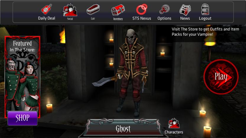
-Ghost
PL-Ghosts | SL-DL-AL- Ghost | SL-DL-AL-Octavos

This is probably not the correct thread to post this feedback but I could not find a better alternative:
The AFK timer that logs you out of the game is a little bit too short, it would be nice if it was about doubled because by the time I come back from the fridge with cookies, pickles and chocolate milk I have been logged out. :P
1) In general, I like the UI
2) I'd like the ability to choose text size, especially in regards to pvp announcements or the ability to turn PvP announcements off. As mentioned by chilango in another thread, the constant stream of PvP announcements is both distracting and covers too much of the screen.
3) Custom key bindings, please!
4) Option to turn off general notifications, especially in PvP.
In PVP, UI seems cluttered with the constant, very large notifications. Other than that, seems fine. And since this is the closest thread relevant to my next suggestion, its going here. Please add an option to change keybinds. I would love to be able to use my mouse 4 and 5.

WRT the PvP HUD, I can't stand it.
What I'd hope might be changed:
--Getting rid of energy, xp, gold, and plat during PvP would be a huge help. I don't see why we need to see them while fighting.
--Moving the X killed Y to where that energy, xp, gold, and plat bars were would be a lot nicer. As it is, they get so caught up when fighting you can't see whats actually happening. I had it backed up for over 3 games earlier. I'd like to leave stuff pertaining to the flag there.
--Get rid of the semi-transparent black background behind the text.
--OPTION TO LOWER THE FONT SIZE!!1!111!1!!one. Why is it so much bigger than PL/SL??
--Option to make notifications disappear after 10-20 seconds.
I've gone from 0 to 1 maybe... 3 times. All from bosses. Level 13 currently, so its pretty rare.Originally Posted by octavos

============================
Anyway, gameplay and HUD is actually very similar to the Diablo (III beta) HUD. Liking that part.
Last edited by Otukura; 04-15-2012 at 12:34 AM.

Since I'm so used to Pocket Legends layout, my thumbs move without me even thinking about it.. just something I'll have to get used to. Great game
Kaytar
The menu button is just a bit high on my droid. I have trouble accessing it. Thanks.
I like PL combat skill buttons as it lets u use all ur skill without scrolling like in SL. Since theres alot of different skills, we should have to option to change the UI so we can put every skill on the screen and also the size of the icons.
So here is what i would love to see in the future changes:
*UI changeable size.
*Able to add additional combat hotkeys.
*Remove unnecessary bars that not required during PvP and Missions. You dont really need to know how much energy/xp u got during missions since we dont even use it during missions.
*Attack button in the bottom right corner. It should get removed as u can attack tapping on the screen but sometimes it doesnt work as well. (need fixing). The charge bar is good but if u remove the attack button, theres many places u can put a charge bar on the screen ie make ur char glow color when fully charge or even a small bar below the char feet.
*Put a scroll bar in the inventory screen.
*When u put ur mouse over ur hp orb, it should show hp regen per 5 sec, total hp.
*Combat skill: i would love to c a count down on the skill instead of color. UI option
What i mostly want is the option to change UI to suit each person needs. Every1 is different so UI should be different.

I would love to see a chase camera option in DL. It would help out a ton in pvp.
ALrighty pics say 1000 words. so here it is.
Part 1- Number of each level for easy display of energy needed for level,
Part 2- shows little money icons from levels you did not know you did, (i do cross levels because sometimes one level doesn't have the energy i need to burn)
Part 3- a collect all button, this helps instead of going to each level and collecting, this helps with part 2
other thoughts--> if energy would level up as you do then these would defiantly help.

Last edited by octavos; 04-16-2012 at 12:00 PM.
PL-Ghosts | SL-DL-AL- Ghost | SL-DL-AL-Octavos
Ah... I just realized that these two posts belong in this thread.
http://www.spacetimestudios.com/show...an-scroll-down
http://www.spacetimestudios.com/show...or-blood-packs
The Chrome movement controls are different from PL & SL. If you jump into this game after those games you use up blood packs before you realize what you are doing.

I like how friends are displayed when they play dungeons, but I don't like how when I tap Join Friends, it's just a message to them. I skip that and just join the dungeon and hope I'll see them. Actually if we sync properly, we do see each other repeatedly or often enough that it's nice.
Star light, star bright...
Im going to start with the good stuff I believe space time studios did a great job with 80% of the game the fighting PVE and PVP part is awesome that's the good and 80%!!! However some of the timed parts for the missions is just to long and cost almost 5$(USD) to bypass timer is way too much I am a platinum user and its just too much. Also there should be a way to level up your energy ie higher level gets more or the high the level you recover energy faster. Also there's not enough diversity with weapons ans stones I love and hate the vanity clothes just seems like there should be drop for them so it'd not always buying them. Also the weapon stats are not diverse enough Im PVP 16 and have yet to find a weapon better than the one they start with the premium pack.
The font is just too small on a phone screen and the X to exit windows and go back to previous ones are hard to hit just right because they're very small on a phone.
I would like for Back on Android to be able to back out of dialogs and for Menu to open the game menu. Or if you're dead set on making Back open the menu AND back out of stuff then at least allow Back to be used multiple times. If I went two dialogs forward Back only backs me out of one, then have to X out the other. Like going Menu, Lair, can only back out of Lair. Or opening something from the Menu on top of a Stash dialog, you can only back to the Stash and not all the way back.
Please?
AL Kar | PL/SL Karaai | DL/AL Karai | SL Karaii | AL Karwar | PL Squishybirdie | PL Gotnorange

I would.like to be able to list some friends as favorites

Yeah.
Elysony 66 Mage.
Elysony 19 Vampire
DOWN WITH THE REP!
Here is another, this improves on the stuff we use much of...it gets annoying if there is many alts and plus...there is room
PL-Ghosts | SL-DL-AL- Ghost | SL-DL-AL-Octavos
 Posting Permissions


Bookmarks