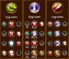
So my initial thought was as I've given the example (p = Perk) it didn't make sense to have a 3rd collom as you would have to activate your upgrade to be able to select the perk
It wasn't until I started to add text to the image I noticed the icons for the upgrades are different sizes with the center ones being slightly larger (perks on the left and right)
Maybe something up for a vote but in my opinion at least would seem to flow better going from left-right or seeing as it is still in development perhaps different icons completely from the upgrades themselves to make it more distinguishable
Looking forward to messing around with the skills after all these years of using the same 2/3 different sets (PvE, Honor & Outpost) XD
Stay blessed


Originally Posted by BaronB


Bookmarks