


Hey guys,
So as some of you know, I am currently designing a T-Shirt for my friend's clothing line he's working on launching. He's focusing on the EDM music scene and will be taking songs from big name producers and designing shirts to go along with them. He asked me to try to whip something up, and as I'm going to the Benny Benassi & Friends tour in NYC on June 9, I decided to design a shirt based on one of my favorite producers, Hardwell.
One of Hardwell's biggest hits this past year has been the song "Spaceman." The tune previously had no lyrics, but only as recently as a few days ago, Hardwell released the official vocal edit of the track, now called "Call me a Spaceman." He played it a few times during his radio show "Hardwell on Air" but the song is now available for purchase. I don't really like to work with outer space style images, but I couldn't turn this opportunity down. Once the design is finished, I plan to send the design to Hardwell himself to see what he has to say about it, have the shirt made, and wear it at the show. Would be pretty cool to see my design at other shows over the next year as well.
So I decided I'd use this thread to update everyone on my progress. I will post a new picture/series of pictures after each big change to the image. As the show is June 9 I don't have much time and I would really like to be done by Monday...but who knows.
So I decided right away to just find some kind of render I could use for a spaceman. As this is a shirt, I wanted to go with something a little cartoony or cell shaded. Nothing too sharp in color with soft edges. A simple google search of "Spaceman" brought me to this perfect image:
The actual image Hardwell uses for the tracks label is a spaceman similar to this one standing ontop of Earth holding a flag with the music label he belongs to on it. I decided I would also include Earth. The earth I picked it used right now for placement more so than a final design, so that image is not important yet and you can see it in the end of this post when I post my final progress thus far.
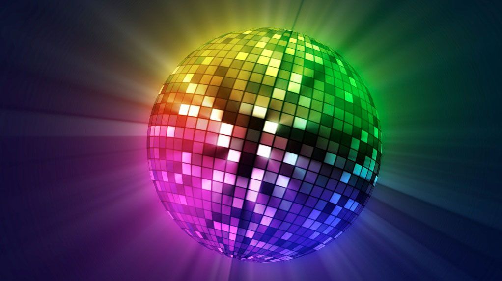
Who's in the helmet?
The hardest part of this first step was deciding what to do with the helmet of the spaceman. I could have gone so many ways with it. At first I didn't want to put anyone's face in there, and have it be mirrored. However, finding an image of a mirrored ball was very hard to do because...well, they're mirrors. The people taking the picture are reflected back to the camera. The amount of work to fix this didn't seem worth it...so goodbye mirror ball.
However, the search for a mirror ball brought up this multicolored discoball. Not only does this remind me of one of the Daft Punk helmets,but would also add a really cool effect to the helmet to make it seem like the entire thing is actually a computer. The colored mirrorball was added to the layer list.
Next I decided I'd find a few pictures of Hardwell's face to throw in the helmet to see if I could work with an actual face inside of a cartoon like body. I was originally drawn to this picture because I liked that it was already shaded on one side, meaning I could get away with lighting effects on just one side.
However, after about 2 hours of fussing with some lighting effects and other faces, I decided against the half face and went with another picture. This was the easiest one I found. I was going with a desaturated look at first, but I instead ended up adding a LOT more color to his face.
Putting things in order
Now that I have the main parts of the START of my project, it's time to put together what I have. After cutting out the Spaceman from the white background, I duplicated the layer about 6 times and put a layer mask on one over the helmet only and hid the other 5. I did a sloppy job on the cutting for the most part because all the aesthetic edits and tuning come at the end. For the most part it's pretty clean, just a little too sharp on some parts. With the layer mask in place, I could put Hardwell's face behind the helmet and have it show through. After cutting out his head and neck, I began to fit him right in the middle just below the top of the helmet. The head is supposed to be big compared to the rest of the body, so the size of his neck compared to the rest of the body will just have to do.
I then took another one of the layered spacemen, and erased everything but the helmet. I wanted to use the already existed lens lighting from the stock photo because I hate making them myself, so I just edged it up a bit, layered it on top, and dropped the Opacity down to 75%. This made Hardwells face barely visible, something I'd take care of later.
It was now time to add some reflective color/nebulas in to the lens. I decided that I was going to keep it simple and stay away from doing realistic reflected images in the lens because a small error with that can be very noticeable to someone, or even everyone other than yourself. Space is Space. I can be whatever I want it to be. So I threw on a couple randomly colored Radial Gradients over Hardwell's face and helmets. These gradients would soon be turned in to nebulas. Using THIS image, I would create a very basic overlay of stars and lights. The radial gradients were set to linear dodge to easier add color to the image without blocking what's behind it completely.
Putting this over the other layers, I cut around everything I didn't want on the image and left just the helmet. I set the layer to overlay, and then created a second layer of overlay, only with 25% opacity, and I then combined the 2 layers into 1. I now decided to address the issue of Hardwell's face being hard to see. I duplicated one of the face layers, moved it to the top, and changed the blending mode to overlay at 100% opacity.
Hardwell's face was looking a little soft and white and the other colors were a little too bright as well. I added 2 different adjustment layers that I use all the time to adjust this. I threw on a Purple to Orange gradient map on Soft Light at 100% opacity and clipped it to hardwells face. I then put another Purple to Orange gradient over the entire image. This is only temporary and will more than likely be masked to exclude the vast majority of the background. I then wanted to lower the saturation of the colors to make the image look a little stressed, so I made a Hue/Saturation adjustment layer and lowered the Saturation to -25. This provided a subtle change for some parts, but really brought down some of the obnoxious colors over the helmet.
I then quickly created a noise layer behind the entire picture to make some quick stars for presentation value for today's picture. They will most likely not be the final stars in the background. To make stars like this, you need to create a noise layer at 10% noise set to Gaussian distribution and Monochromatic checked on. You then need to erase some of the noise because it is very "noisy." To do this, you need to change the white, grey, and black levels of the picture under layer adjustments. Change around the settings and see what you like. This will make the white stars that remain seem brighter and gets rid of a lot of the others.
After creating the noise, I made a quick Gradient Overlay of black to white set to radial. I put the gradient behind the spaceman and turned down the opacity. This creates a grey looking circle and an all black background. To add a quick base layer of primary colors, I needed to render a light effect. I picked the RBG (red blue green) 3 light effect because it's honestly the cheap and easy way to create any of the primary colors without much effort. With that said and done, I was left with a very boring looking circle of red light behind the spaceman and hints of blue and green. Anyone who is familiar with photoshop or space effects knows that rendering clouds is a very easy way to achieve that fluffy, nebula-like look. So I rendered some clouds. Fun stuff. The clouds needed some color and some direction because they were quite random. I don't like using lens flares because they make the image a bit grainy, so I decided to just get away with an easier step for now and try some other editing techniques at later stages off development. I went to the clouds blending options and set them to overlay. I then went to Gradient Overlay and picked 4 colors that I wanted to use. Instead of creating my own gradient, I picked the rainbow spectrum that was premade and erased some of the colors, and replaced the others with my own. I like this spectrum because it has the white, grey, and black limiters on the outsides of the colors. The next part was annoying and I still don't know how I feel about the outcome so far...and that was deciding where the background colors will be behind the spaceman. In the end, I landed on an Angled Gradient Overlay set to 70 degrees, 50% opacity, and 100% scale. Although the outcome is NOT what I wanted, it was good enough for now to show you guys the direction the image is going. Please note that I am very aware that the colors of the mask do not match up with the colors behind the spaceman. This is because the colors in the mask are a reflection, and the colors behind are supposed to just be for added effect and depth once they're finished.
So there you have it, that is what I accomplished today on my shirt design. To the untrained eye this might look good or even finished...but it's not. This is not even a rough draft yet. This is me throwing things together on a page and seeing what works and what doesn't. I probably have about 50 layers of hidden material not even in the picture that I'm not sure if I'll use or go back to. I have about 6 different Hardwell faces lol
I really do appreciate it if you read this far. I know this is extremely long and half of it probably jumps around and makes no sense. I apologize for not having pictures along each step for those who are curious to see what everything looks like in the process. Truth be told I am writing this up long after I stopped working for the day. Going back and hiding layers just to take screenshots could lead to me accidentally adding or erasing something to the applied image that I don't want...so for this step, you get the final image of today. Everything is still saved as layers at this point, this is simply an Applied image creating a PNG file of all the active layers and saving it as a copy. Let me know what you think! Have any ideas you think would look cool? Let me know!
Hopefully I'll have another update for everyone tomorrow!
Day 1 Current Progress


 . I'm very disorganized, I really need to be better about naming my layers.


Bookmarks