
Wait in still making mine!!!!! Can it be done at the 19th?? Please?


Wait in still making mine!!!!! Can it be done at the 19th?? Please?
"...And may the odds be ever in your favor." ~Effie Trinket
Guys read the posts. Deadline is the 10th...
I have 2 sigs for you, same thing but different toons.
~TheRajX
(Blue Arcs, Japanese Rising Sun, Phoenix, and both girl and boy toon)
Last edited by TheRajX; 07-09-2012 at 08:28 AM.


Looks good Rajx :-) I really like your style!
"Still Retired but casually dueling in PvP from Time to Time"EXTREME BOSS SLAYERS Are Back!Wanting a signature? Send me a Pm (SL credits only)
re-edit. Figured no time for a new one so I wanted to chuck this one out there in the process
I even have a script that displays one image but when you refresh it, it will automatically randomly choose between the two and display. Unfortunately these forums are not compatible with the image because they save their own copy of the image instead of displaying it via the original link...Originally Posted by Mitchturbo
Its a pity, but thanks for the compliment! I like your style too!
Here it is: http://dynfosig.com/karanraj_uploads/ark/arkk.png
~TheRajX
Last edited by TheRajX; 07-09-2012 at 09:07 AM.
that's sexy man, looks good. lol
That looks a lot better :-) Good work!
"Still Retired but casually dueling in PvP from Time to Time"EXTREME BOSS SLAYERS Are Back!Wanting a signature? Send me a Pm (SL credits only)
lol good work on the pet as well xD

asdfhgjkl, you guys are making it harder for me to pick the winner now >_<. this is gonna be hard Dx
SL: Ark;Misfit;Sleepingpills;Hugster // DL: Ark // AL: Ark // PL: Ark
[Retired Player]

Blur the background of that a bit and it'll be mint.
I was gonna do something with blue/purple or blue/pink colors too...but I can't stand the 100 pixel height limit for renders unless it's something like you have in your sig with a great sideways angle.
And I don't like doing work on a bigger canvas than is allowed here, cause it looks all great and then it gets shrunk down to nothing lol.
140-200 (pushing it....180 maybe) would be the ideal height for renders.
Last edited by Flowman; 07-09-2012 at 11:50 AM.
The second tab used when uploading an image can be used to enter a URL. Idk if the forums will allow it. Have you tried that?
*sniff* I have so much to learn
A sharpened foreground over a blurred background creates an image of depth and allows you to perceive that the image is actually an image infront of an image, and not a flat picture.
I use vector backgrounds. If I use the liquify effect, will that produce the same results? Because many forum sigs I've seen seem to use the smudge tool to get the blur before adding renders... and I'm not that good at that, yet...
Vector's are more or less supposed to be sharp...but are meant more to be effects, or to build off of a render, not to be actual backgrounds. Throwing an image over a sharp vector can sometimes be confusing unless it "flows" with the render and doesn't clash for visual attention.
Here is an example of what I was suggesting to him from Signaturestop.com (Great intro tutorials). This is the first ever tutorial I'd seen on depth a long time ago:
BEFORE
AFTER
Throw some fractals and effects in there and you've got a pretty nice design in very little time. All this involves is Gaussian Blur, Masking and black painting over the focal point on the mask layer, and then adjusting the curves (color curves that is).
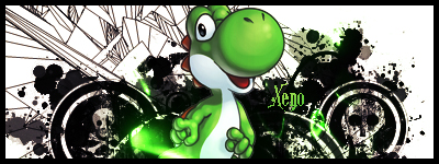
Here is an example of using vectors (and splatter brushes) to make a signature:
It's not the best vector signature I've seen, but it's the first one I found on google that shows what I want to show. The vector brushing and splatters are in the background, but aren't actually the entire background. They're used to accent the Yoshi Render and give him some extra flare. Now imagine if the whole background was black shapes like that? It would take away from the image because it would look like Yoshi was resting on a flat black design. Do it like this, and it looks like he's a part of it, floating on the white background.
Sorry to thread jack Ark, I might post an entry now just because I plastered your thread with this. Hopefully someone learned something from this though.
I did lol, I'm gonna rework the signature using your advice, thanks. By the way, someone told me 500x 190 was the best size for a forum signature. A friend of mine did some work for me back in the day.
Didn't seem to put much effort in the first one, since I still think he ripped it from somewhere and stuck my name to it -,- but I loved the second, I can only say that now because I have a somewhat "amateurish" experience with gfxing. lmao
I REEEEALLY wanna know how he was able to smoothen out the second image, beccause what I gave him had poor quality. Maybe he made it smaller idk...
FTR I still don't know how to use the splatter brush, but I'll learn that too in time...
Last edited by Aaroniero Arruruerie; 07-09-2012 at 12:31 PM.
I'd have to see the original render to tell what he changed. Send it to me in a PM so we can stop flooding Ark's thread.
Feh...

Last edited by Aaroniero Arruruerie; 07-09-2012 at 05:31 PM.

yea lol , did that in a couple of minutes before i rushed to work. The size limit is annoying, mine usually are at 150 couldnt go any higher with out sacrificing quality.
It's alright (: no worries.
SL: Ark;Misfit;Sleepingpills;Hugster // DL: Ark // AL: Ark // PL: Ark
[Retired Player]
 Posting Permissions


Bookmarks